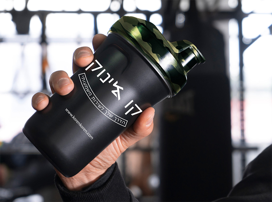
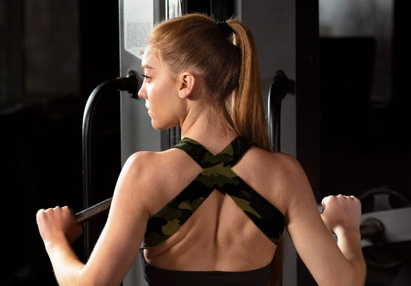
The challenge was to build a digital store that speaks the ‘language’ of combat fitness. It needed to be more than just an online shop; it had to feel like a training camp. I had to balance a dark, tactical aesthetic with a clear and effective shopping experience, ensuring that the products look as powerful as the results they provide.
I chose a bold, high-presence typography and a high-contrast color palette of black, tactical yellow, and military green. The layout was designed to be ‘heavy’ and impactful, using strong shadows and glows to make the products pop. Every section, from the bundles to the testimonials, was crafted to maintain a sense of urgency and peak performance.